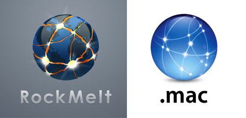
I guess I can get on board with that, though I still have this nagging feeling that RockMelt's designers just looked at Apple's old .Mac logo and said, "Let's corrupt that." Like they took the .Mac sphere, with it's hopeful points of light, and said, "Let's turn those into lacerations, where evil spirits are escaping the bowels of hell." You can actually count about four exact paths they've ripped off from the .Mac logo, all to build the hype that RockMelt will destroy the geophysics we rely on to hold the planet together.
Fair enough. If once we complained about an Internet Explorer monopoly, we've now got Firefox, Safari, Flock, Opera, Chrome and others. Segmentation seems to be the theme for advanced commercial civilization, and we all know competition is good for a rational marketplace. So if IE is still Rome, maybe RockMelt will destroy the empire in a way we can all get behind.
But we'll know their designers were probably using Safari.


2 comments:
That is the illest, freshest, dopest designed logo that I have even seen in my entire intoxicated & non-intoxicated life! Props to the designer, which I have no relation to... Next phase it should transform into Unicron and destroy the Earth with his bare hands.
I'd even settle for a face-off with the Death Star.
Post a Comment